
Brand Guide
Welcome to our brand guidelines and assets. We want to make it easy for you to integrate BaZing into your materials. Let the marketing team and these guidelines be your resources.
Our Logo
The logo is only used in black and white and the BaZing icon and logo-type should always remain the same color. It should appear on all of our visual communications, from stationery and literature to electronic media and signage.




Co-Branding
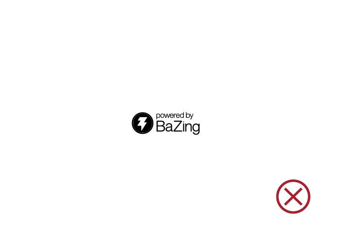
Use only the Powered logo or Powered icon to support a Financial Institution's logo, checking account, or program. Do not modify the color, design, or any other elements of the BaZing logo. The BaZing logo must have "powered by" in order to be co-branded.
Margin Zone
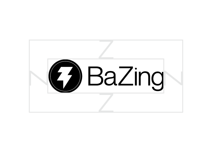
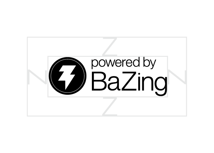
Our logo should be surrounded by a minimum amount of clear space in which no other graphic element may intrude. The logo and icon's margin zone is equal to the height of the "Z" in BaZing.
Logo Misuse
Do not change the appearance of the logo or icon. No attempt should be made to alter the logo in any way. Its orientation, color and composition should remain as provided — there are no exceptions. Also, allow a minimum size to ensure legibility of the logo. The logo should never be smaller than 95px in digital or 1" in print.



Our Color
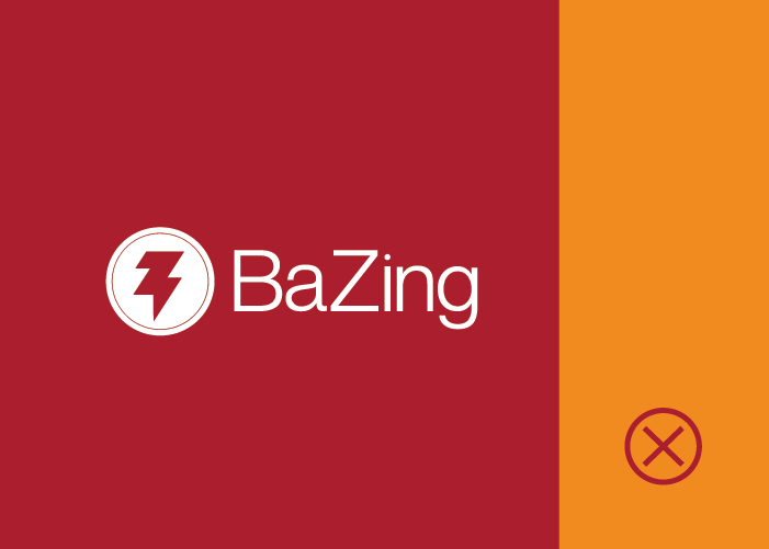
While the logo remains either black or white, the color palette is used for supporting details and design. BaZing Blue is our primary accent color. BaZing Yellow and Red are occasionally used as secondary options.
BaZing Blue
Pantone 300C
CMYK 100, 62, 7, 0
RGB 0, 99, 166
Hex #0063a6
BaZing Red
Pantone 187C
CMYK 23, 100, 88, 15
RGB 170, 24, 44
Hex #aa182c
BaZing Yellow
Pantone 144C
CMYK 3, 54, 100, 0
RGB 241, 138, 0
Hex #f18a00
BaZing Gray
Pantone 428C
CMYK 24, 17, 16, 0
RGB 193, 197, 200
Hex #c1c5c8
Color Misuse
BaZing Blue should be used primarily. Use secondary colors sparingly.



Our Fonts
The Open Sans Family is the primary Sans Serif font and should be used for body copy, headline, and display purposes. The Helvetica Neue Family is the secondary Sans Serif font used for headline and display purposes. Do not use any other typeface within the BaZing brand.
Open Sans
A B C D E F G H I J K L M N O P Q R S T U V W X Y Z
a b c d e f g h i j k l m n o p q r s t u v w x y z
Helvetica Neue
A B C D E F G H I J K L M N O P Q R S T U V W X Y Z
a b c d e f g h i j k l m n o p q r s t u v w x y z
Presentations
Presentations are a huge way to visually communicate to clients, prospects, and CorpsPartners. They tell a story and represent our brand. The below rules will help keep our brand clean, professional, and unified.




Content
- Always spell StrategyCorps with a capital S and a capital C: StrategyCorps
- Always spell BaZing with a capital B and a capital Z: BaZing
- Always spell CorpsPartner with a capital C and a capital P: CorpsPartner
- Always spell CheckingScore with a capital C and a capital S: CheckingScore
- Unless a StrategyCorps event is taking place for a singular group in a singular time zone, always list start as Central Time Zone (CT).(Ex: King of the Hill takes place Tuesday, January 26, 2 p.m. CT. while a concurrent webinar presented solely to the Washington Bankers Association would take place Tuesday, January 26, 11 a.m. PT)
- Use Oxford comma in all content produced for StrategyCorps, CheckingScore, or BaZing. The Oxford comma is the comma used before “and” or “or” in a list of three or more items (as shown in the previous sentence.)
- Unless you are composing legal documents, follow any punctuation used with a single space between sentences — not two.
Photography
Our photography is shot in-house. This allows us to have one of a kind images that speak to our unique, candid, and natural, style. Do not use stock photography found on the internet.


We're here to help
If you have any questions about this guide or if you are unsure if your communication best represents the BaZing brand, please contact us.