Brand Guide
Welcome to our brand guidelines and assets. We want to make it easy for you to integrate the StrategyCorps style into your projects. Let your marketing team and these guidelines be your resources.
Our Logo
The corporate logo consists of two elements: the mark and the type treatment. The horizontal alignment of the logo (top row) should primarily be used. Only use the vertical alignment or stacked version of the logo (bottom row) when working with limited or small space. Only use the black or white logo when color is not an option. The logo should appear on all of our visual communications, from stationery and literature to digital media.



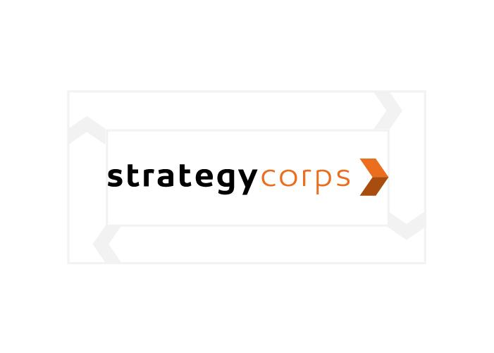
Margin Zone
Our logo should be surrounded by a minimum amount of clear space in which no other graphic element may intrude. The logo and icon's margin zone is equal to the width of the arrow.
Logo Misuse
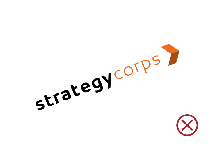
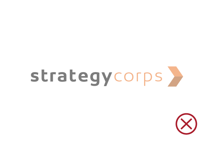
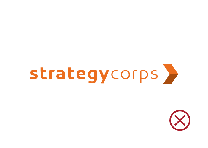
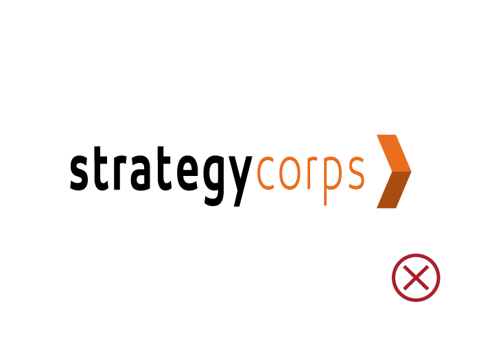
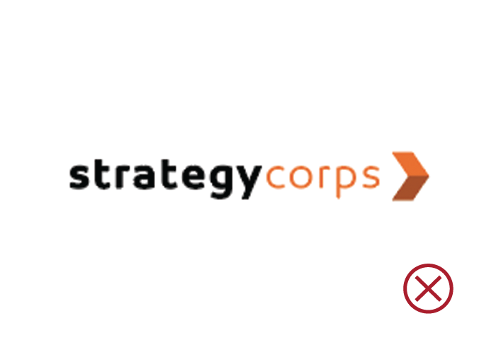
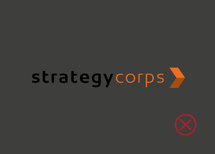
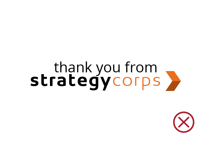
Do not change the appearance of the logo or icon. No attempt should be made to alter the logo in any way. Its orientation, color and composition should remain as provided — there are no exceptions. Also, allow a minimum size to ensure legibility of the logo. The logo should never be smaller than 95px in digital or 1" in print.





Our Colors
Orange and Navy are used as StrategyCorps' primary colors. Burnt Orange and Gray are occasionally used as secondary options.
Orange
Pantone 1595C
CMYK 0, 69, 100, 4
RGB 232, 109, 0
Hex #e86d1f
Navy
Pantone 295C
CMYK 100, 84, 36, 39
RGB 15, 45, 82
Hex #0f2d52
Burnt Orange
Pantone 1605C
CMYK 0, 70, 100, 36
RGB 168, 77, 16
Hex #a84d10
Gray
Pantone 422C
CMYK 41, 31, 32, 0
RGB 158, 161, 162
Hex #9ea1a2
Color Misuse
StrategyCorps Orange and Navy should be used primarily. Use secondary colors sparingly. For BaZing, primarily use blue. Refer to BaZing's Brand Guide for more information.


Our Fonts
The Open Sans Family is the primary Sans Serif font and should be used for body copy, headline, and display purposes. The Helvetica Neue Family is the secondary Sans Serif font used for headline and display purposes. Do not use any other typeface within the StrategyCorps brand.
Open Sans
A B C D E F G H I J K L M N O P Q R S T U V W X Y Z
a b c d e f g h i j k l m n o p q r s t u v w x y z
Helvetica Neue
A B C D E F G H I J K L M N O P Q R S T U V W X Y Z
a b c d e f g h i j k l m n o p q r s t u v w x y z
Photography
Our photography is shot in-house. This allows us to have one of a kind images that speak to our unique, candid, and natural, style. Do not use stock photography found on the internet.


Presentations
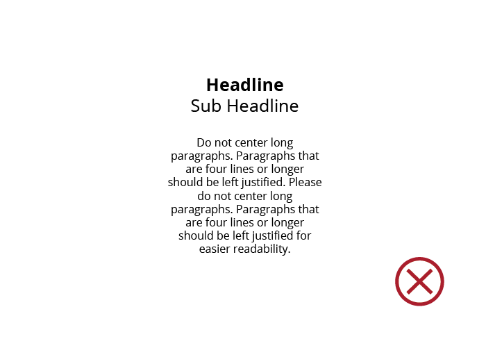
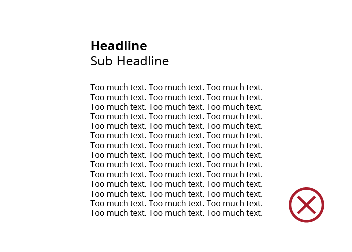
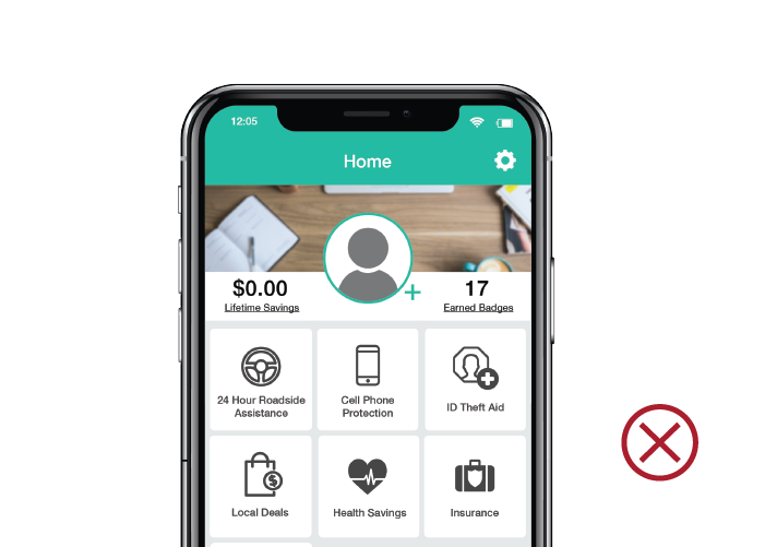
Presentations are a huge way to visually communicate to clients, prospects, and CorpsPartners. They tell a story and represent our brand. The below rules will help keep our brand clean, professional, and unified.




Content
- Always spell StrategyCorps with a capital S and a capital C: StrategyCorps
- Always spell BaZing with a capital B and a capital Z: BaZing
- Always spell CorpsPartner with a capital C and a capital P: CorpsPartner
- Always spell CheckingScore with a capital C and a capital S: CheckingScore
- Unless a StrategyCorps event is taking place for a singular group in a singular time zone, always list start as Central Time Zone (CT).(Ex: King of the Hill takes place Tuesday, January 26, 2 p.m. CT. while a concurrent webinar presented solely to the Washington Bankers Association would take place Tuesday, January 26, 11 a.m. PT)
- Use Oxford comma in all content produced for StrategyCorps, CheckingScore, or BaZing. The Oxford comma is the comma used before “and” or “or” in a list of three or more items (as shown in the previous sentence.)
- Unless you are composing legal documents, follow any punctuation used with a single space between sentences — not two.
We're here to help
If you have any questions about this guide or if you are unsure if your communication best represents the StrategyCorps brand, please contact the marketing team. For more information about BaZing, visit the BaZing Brand Guide.
